IClicknPrint Projects, Printable Cards
Small Business DIY Perfect Business Cards with iClicknPrint
We live in the age of technology, of that we can be sure. But that doesn’t mean that the core elements of a business, like business cards, have become passé. Think about it, judging by the number of cards most business professionals collect during the average week, they’re obviously still relevant. This means that you have to create a great card that will position your company as relevant too. Simply put, business cards are still a viable, and cost effective, marketing tool for your company.
Withcard that portrays your business in a professional manner. iClicknPrint.com can help you do just that by using the Online Design Center with pre-perforated Geographics Business Card stock.
The Right Logo
Obviously, when you place a logo onto the card, it will be a lot smaller than on other marketing materials. A complicated or even wordy logo will not translate well to a business card. Logos with too many colors, words, fonts, intricate graphics, etc. may look good on some items, but will not look good across the board. Before creating your business card, evaluate your logo. Can it be used everywhere to create synergy between the company and marketing materials?
Just The Facts
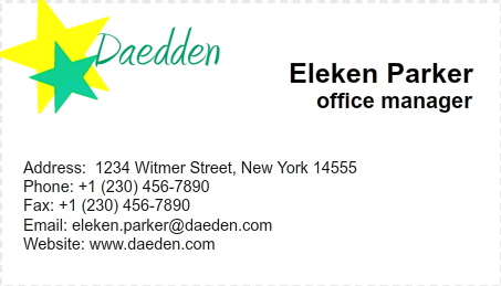
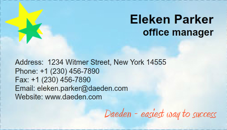
Business cards are small and are not meant to “sell” your business; therefore, they should not be used in lieu of a brochure or other marketing materials. Only list these details:
- Your name
- Your title
- Contact information
- Website
- Logo
- Company tag line
Font Is For Text – Not Art
A clean sans serif font works best. Fonts should be consistent throughout the card. Remember, fonts are used for text, adding colors and word art won’t make your text look professional.
White Space
Most good business cards have a lot of white space, which is called negative space. Good cards have a lot of white, blank space. This allows the design elements to stand out to the reader.
Choose Colors Wisely
The same rule applies to business cards as painting your living room; pick a couple of key colors that complement one another. You might have a flair for color but when somebody sees it, they might see it as amateurish.
Use The Back Too
The front of your card serves the purpose of telling people who you are, what you do, and how to contact you.
Why not give the customer a reason to hold on to YOUR card? Consider putting something on the back. The goal is to supply a reason to hold onto your card instead of throwing it away. An offer? Discount? Tip? You really want something that reflects your business and encourages clients to use your card.
End Of The Day
A classic design with simple design elements and your contact information is all you need to achieve a professional appearance. Fortunately, you’re not alone, you’ve got iClicknPrint.com.



 .
.

